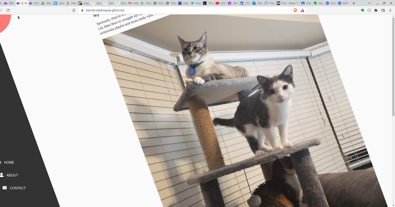
This project from the Udemy 50 Projects in 50 Days course was really a lot of fun. The user is presented with a page containing an article and image, with a semicircle in the upper left with a menu icon. When the menu icon is clicked, the entire article rotates and a navigation menu slides out from the bottom left.
As with the other 50 in 50 posts I've done, this is not a re-hash of the steps covered in the lecture. Rather it's my notes on the interested aspects covered.
This project was my first exposure to FontAwesome and their collection of icons. This is one of those things that is ubiquitous across the web, but I had never stopped to consider where they actually came from. When you see the three bars for a menu, a search icon that looks like a magnifying glass, all those buttons for various social media accounts - chances are, they're being linked from the FontAwesome icon set. In fact there are far too many icons to try to keep straight, so I strongly recommend you bookmark this cheat sheet if you plan on making use of it. I saved it to my Evernote account.
There are quite a few interesting uses of the transition
and transform
CSS properties in this project. I had used those before (although nothing this involved) but I did want to highlight a new concept I learned with this page, transform-origin. One of the things I really like about the approach to this course is that occasionally (although not to the point that it becomes annoying), the instructor pauses to show the project preview as it stands at that point in the code. In this case, he added the rotated class that we had just created to the article so that we could see the effect. Rather than rotating up and to the right, the whole thing just spun in place. He then explained that by default, the rotate property takes place from the center of the page. That can be changed by transform-origin, which was then set to the top left.
Conceptually, this whole project - which, I have to admit, looked very daunting in the preview video - ended up being essentially just a lot of transition and transform values with a couple of lines of JS to add and remove the transition effects from the various divs.
It is an excellent showcase of the power of plain CSS for pretty dramatic effect.
